What is a Theme?
The Tyk Enterprise Developer Portal uses themes for customizing the live portal. We provide an out of the box theme that is using our own branding, it’s called thedefault theme. You are welcome to use it and modify it for your needs, yet if you want to start with a blank page, you can also create a completely new theme.
The following section explains how they are structured and their main concepts. We recommend you to read this if you are creating your own theme, or making extensive changes to the ones we provide.
File Structure of a Theme
Generally speaking, a theme defines an application’s styling, templates and scripts. In the Tyk Developer Portal athemes folder is located in the root of the application and is the directory where each theme folder must be added. If you navigate to path /themes/ you’ll see our default theme which has the following structure:
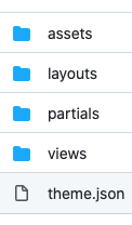
- Manifest file (
theme.json): It uses JSON syntax to define theme metadata (name, version and author) as well as a list of templates that are part of the theme. assets: It intended for static assets like CSS, JS or images that are used by the theme. All contents from this directory are mounted under the/assetspath in the portal HTTP server.layouts: The layout is the top level view of your theme.views: The view is rendered as a part of a layout. Each view can be rendered using a different layout.partials: Partials provide an easier way to handle snippets of code that are reused across different views or layouts, for example if you want to inject a JS snippet that’s used in different places, you could set this code in a partial and include it anywhere by using the appropriate ‘Go template directive’. In this way you could improve code readability and organize the theme in the most efficient way.
Manifest File
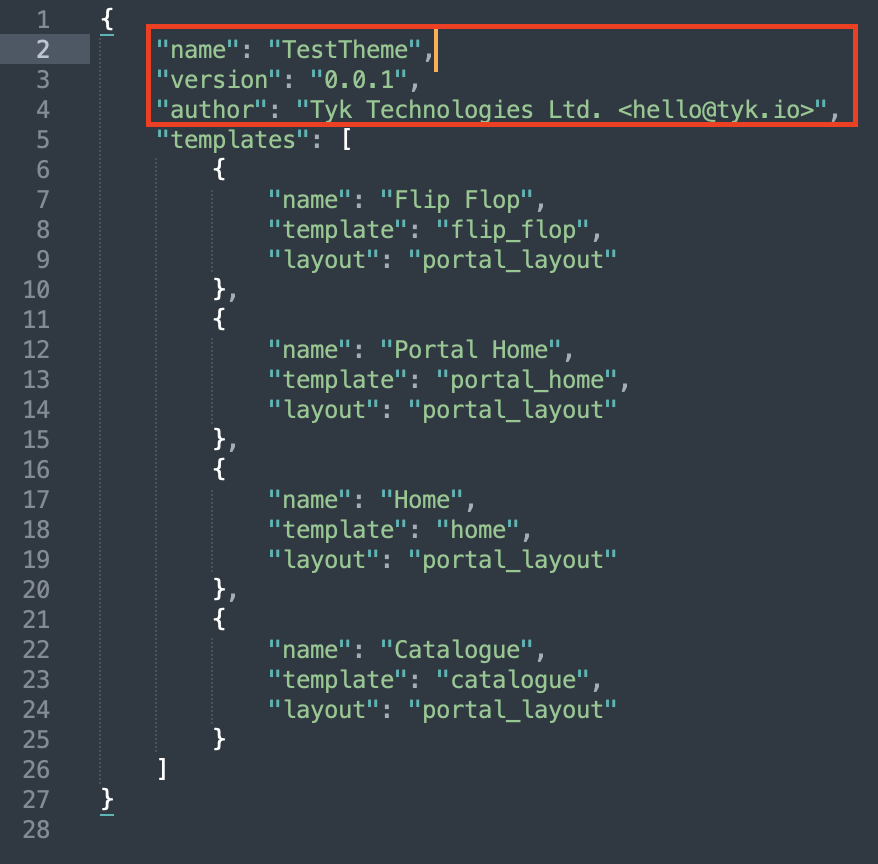
This file should sit in the root of a theme and hold the theme configuration. You can define a name and your templates along other options such as the version and the author. You can find an example of the manifest within thedefault theme that is located in /themes/default. The syntax looks as follows:
templates field establishes a list of available templates. Every template consists of three fields where name is a user-friendly name that will be seen on the Admin app when creating a page. template is a reference to the template file itself. layout is a reference to the layout that will be used to render the previously set template.
To illustrate the current template hierarchy, this is what a typically rendered page would look like. The layout would be the top level template and base structure of the page:
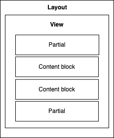
layouts and views but also any combination of them. These combinations are set in your manifest file (theme.json).
Regarding partials, even though the illustration above shows two partials embedded on the view section, partials are intended for using in any place. You should be able to embed a partial directly into a layout, or even in multiple layouts.
Content blocks are explored more deeply in the next sections. To summarise, its relationship with the above hierarchy is when rendering a particular page, a layout, a view and potentially a combination of partials get loaded from the theme directory. Content blocks are different because their content gets dynamically populated by database content. These contents are created from the Admin section.
To be Concluded:
- A layout is the wrapper of everything you want to include inside it. So, typically it would consist of tags such as
<!DOCTYPE html>,<html>,<head>,<title>, and<body>. - A
templateis what we would inject in a layout and specifically within the<body>of a layout. - A
partialcan be, for example, the navigation menu so that you can inject it in the layout and it will be visible every time this layout is used
Go Templates
All theme template files use the Go template syntax. You will find every file in the layouts and views. Partials directory uses the.tmpl file extension, which is the default Go template extension. Go templates work in a similar way to ERB or EJS templates by letting the user mix HTML code with dynamic values. Sample syntax is as follows:
{{ render “top_nav” }}
The code sample above would execute the render template helper, which is a common function that’s used to inject code from other views into the current one. You may use this to embed content from other parts of the theme, typically partials or views. In this case, it will insert a view or partial named top_nav to the template where it’s used.
The same delimiters {{ and }} are used for all Go template directives. We’ll explore some of them in the upcoming sections.
See the Go package template documentation for more information.
Content Blocks
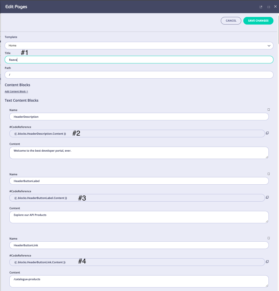
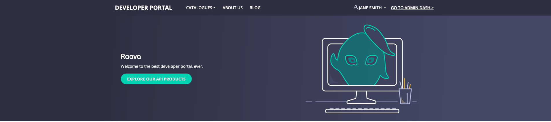
The Developer Portal themes use content blocks to facilitate content management. A content block is defined as a part of aview by using a particular template directive in combination with a name or ID to identify the given block. For example, if you check the home template in the default theme (themes/default/views/home.tmpl), you will find the following code:
{{ .page.Title }}. This is theTitleinput in the form UI (Screenshot #1){{ .blocks.HeaderDescription.Content }}. This is theHeaderDescriptioninput in the form UI (Screenshot #2){{ .blocks.HeaderButtonLink.Content }}. This is theHeaderDescriptioninput in the form UI (Screenshot #3){{ .blocks.HeaderButtonLabel.Content }}. This is theHeaderButtonLabelinput in the form UI (Screenshot #4)
Managing Themes
The Tyk Enterprise Developer Portal enables the admin users and developers to manage themes and select which theme is visible in the portal. To enable this capability, the portal has theme management UI.Create a Theme
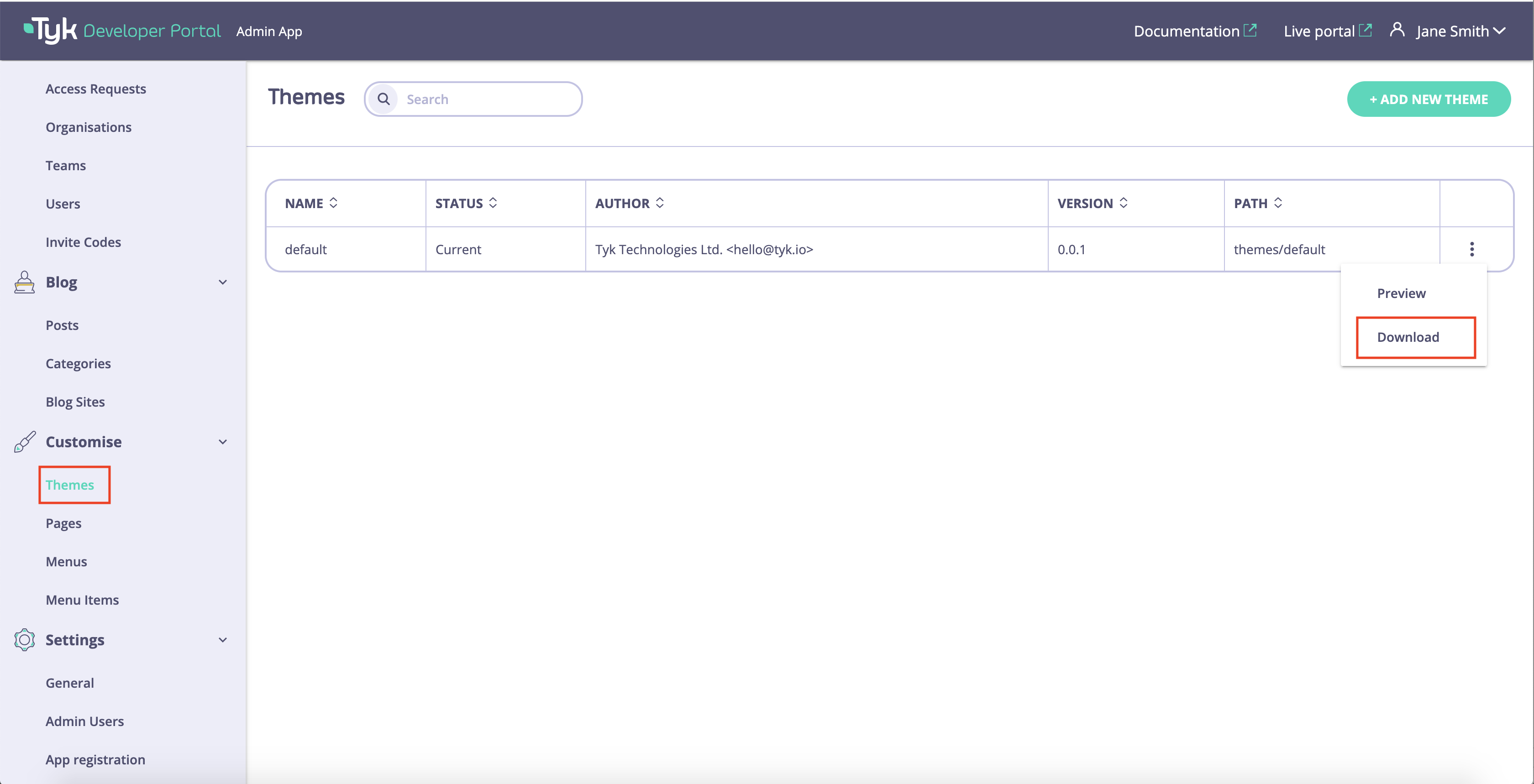
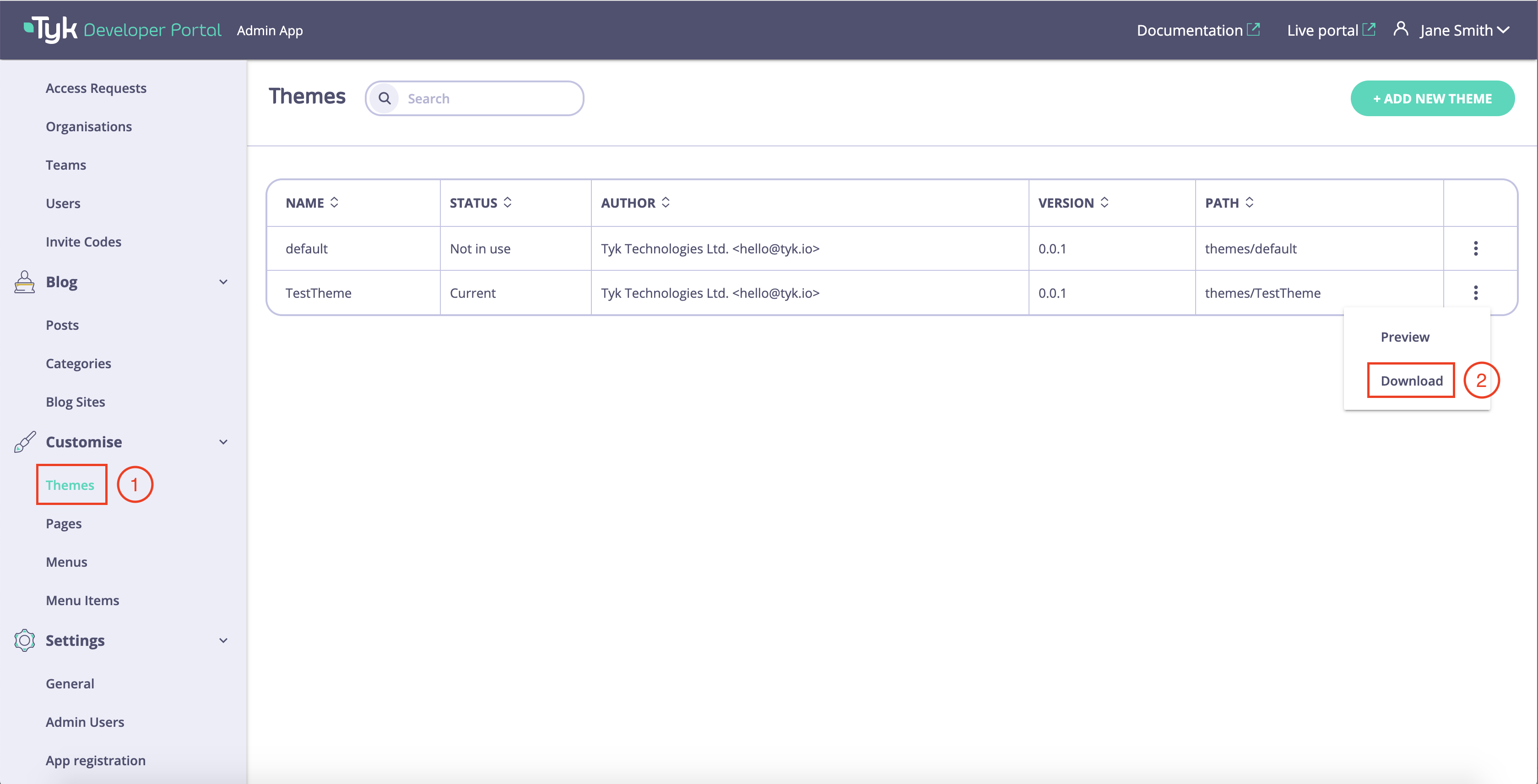
Follow the example below to create a new theme called “TestTheme” using the default theme as a blueprint:- As an admin user, navigate to the Theme management UI and download the default theme. The Tyk Enterprise Developer Portal doesn’t allow modifications to the default theme so that you will always have access to the vanilla theme.
- Unzip the theme and rename it by modifying the Manifest file as described above.
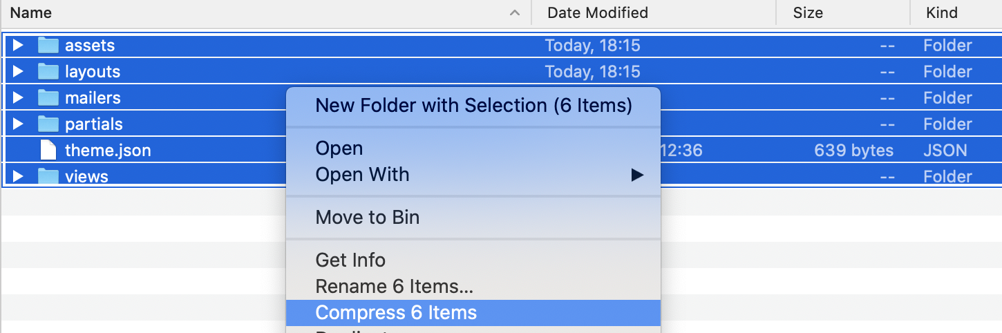
- You can also modify other assets in the theme as described later in this guide. Once all modifications are done, you need to zip the theme and upload it to the portal.
- To upload the theme as an admin user, navigate to Themes and click on the Add new theme button. Please note that the size of individual files should not exceed 5 MB and the total size of all files in the theme should not exceed
PORTAL_MAX_UPLOAD_SIZE. This parameter is configurable.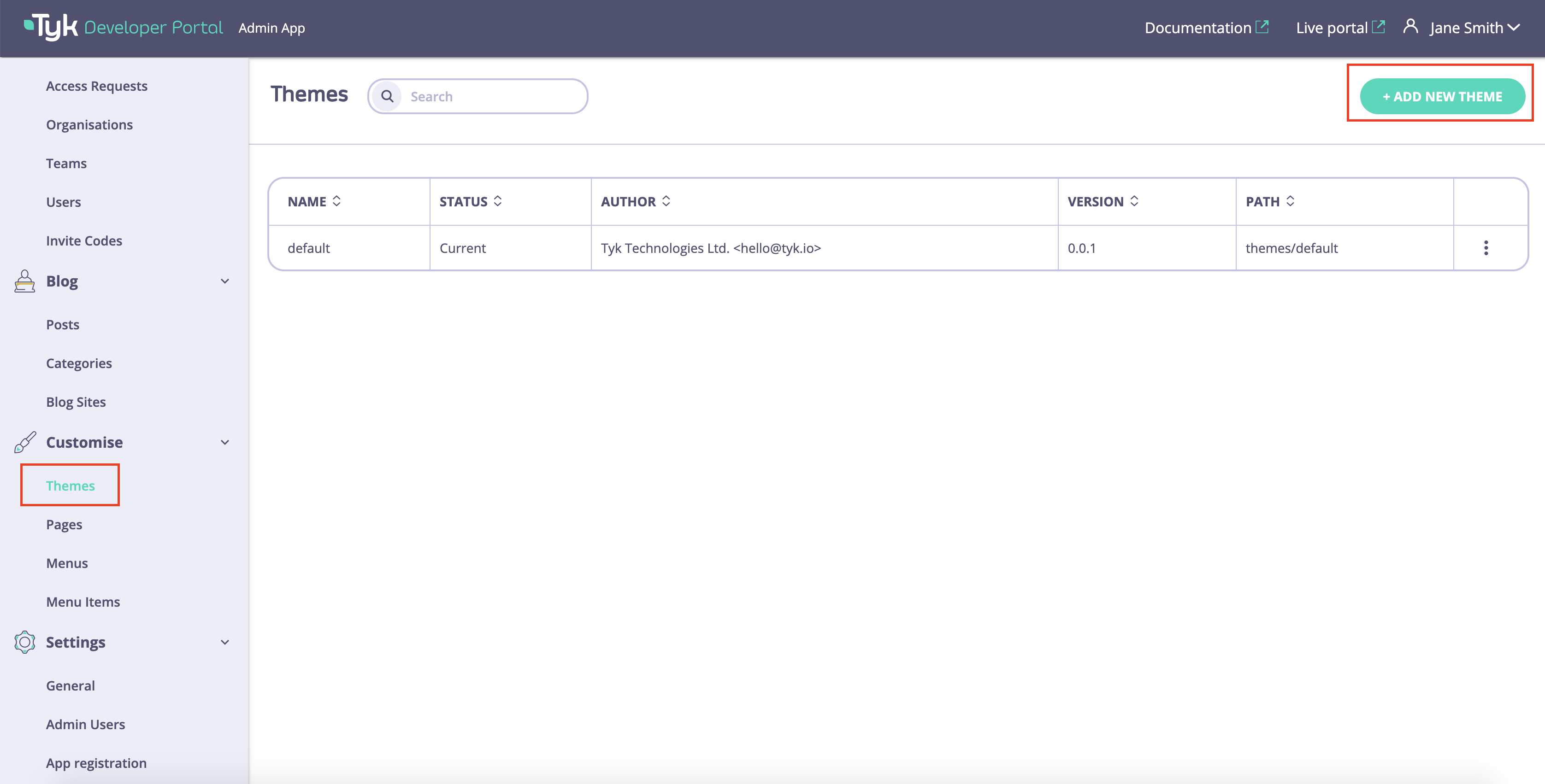
- Then click on the Add theme file button.
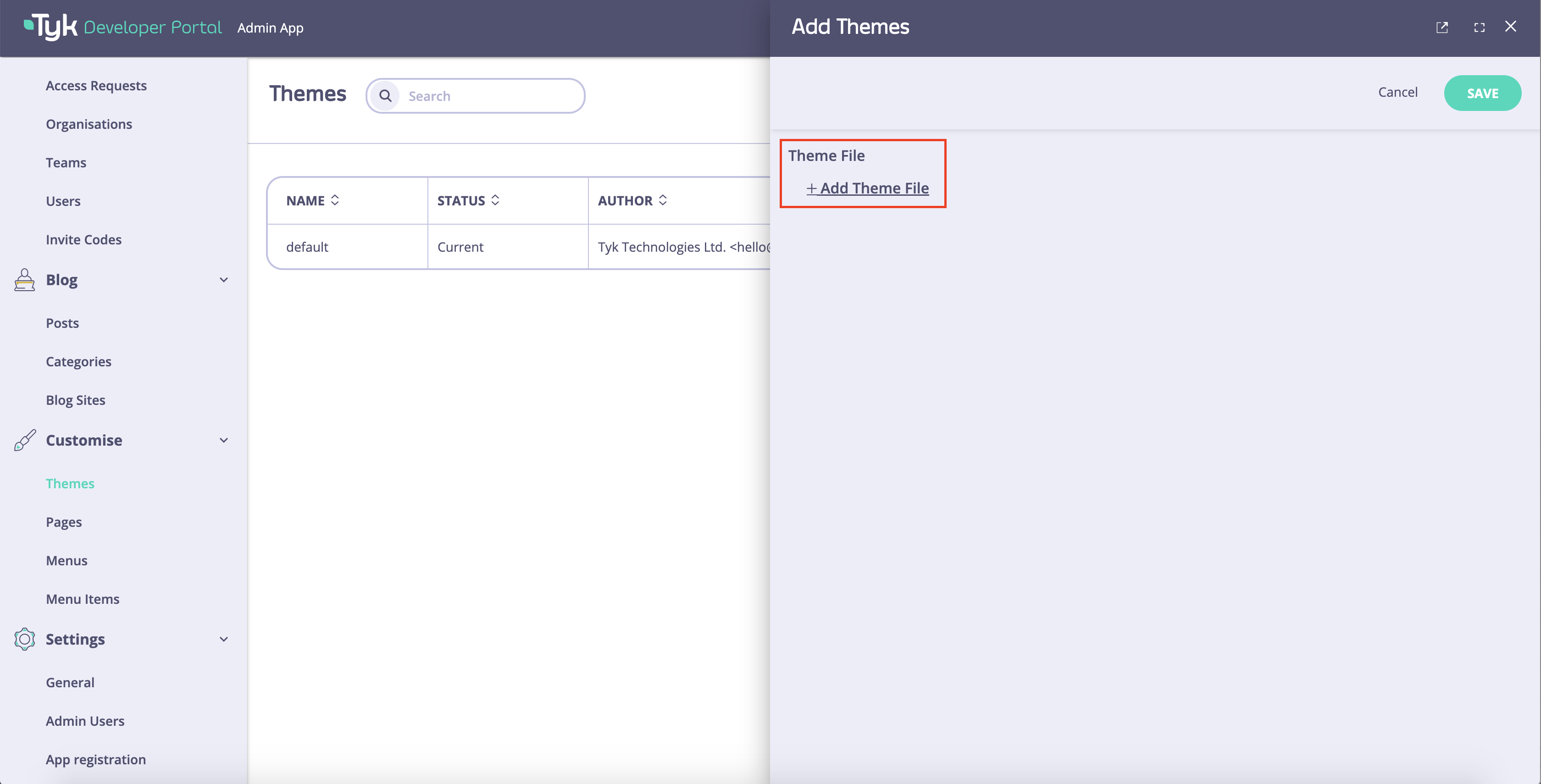
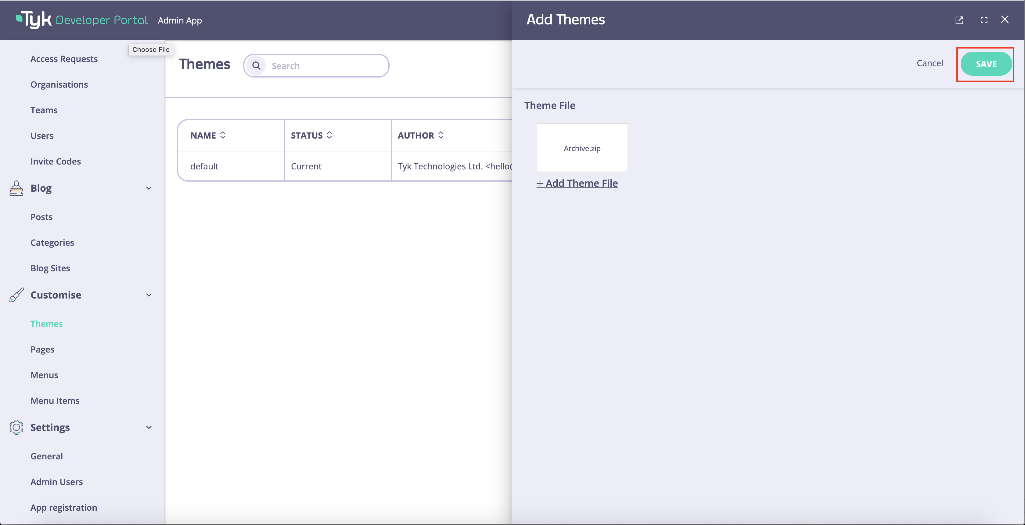
- Select the archive that you’ve created earlier and click on the Save button.
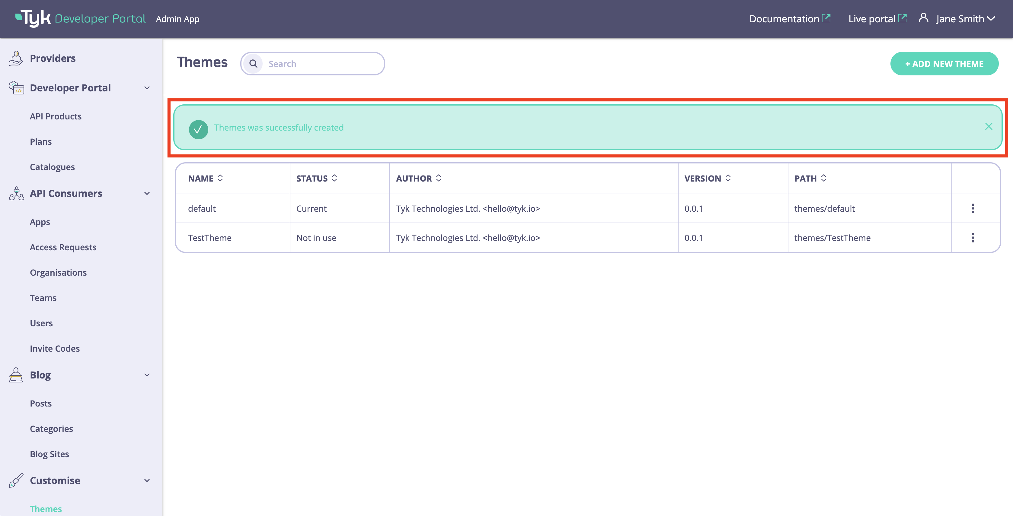
- Now you should see a success message meaning the theme was successfully created.
Preview a Theme
The Tyk Enterprise Developer Portal enables the admin users to preview the theme before it gets reflected on the public-facing portal. This enables to review the changes that are made to the theme before exposing them to the developer community.- To preview a theme as an admin user, navigate to the Themes menu. Select a theme, and click on the Preview button.

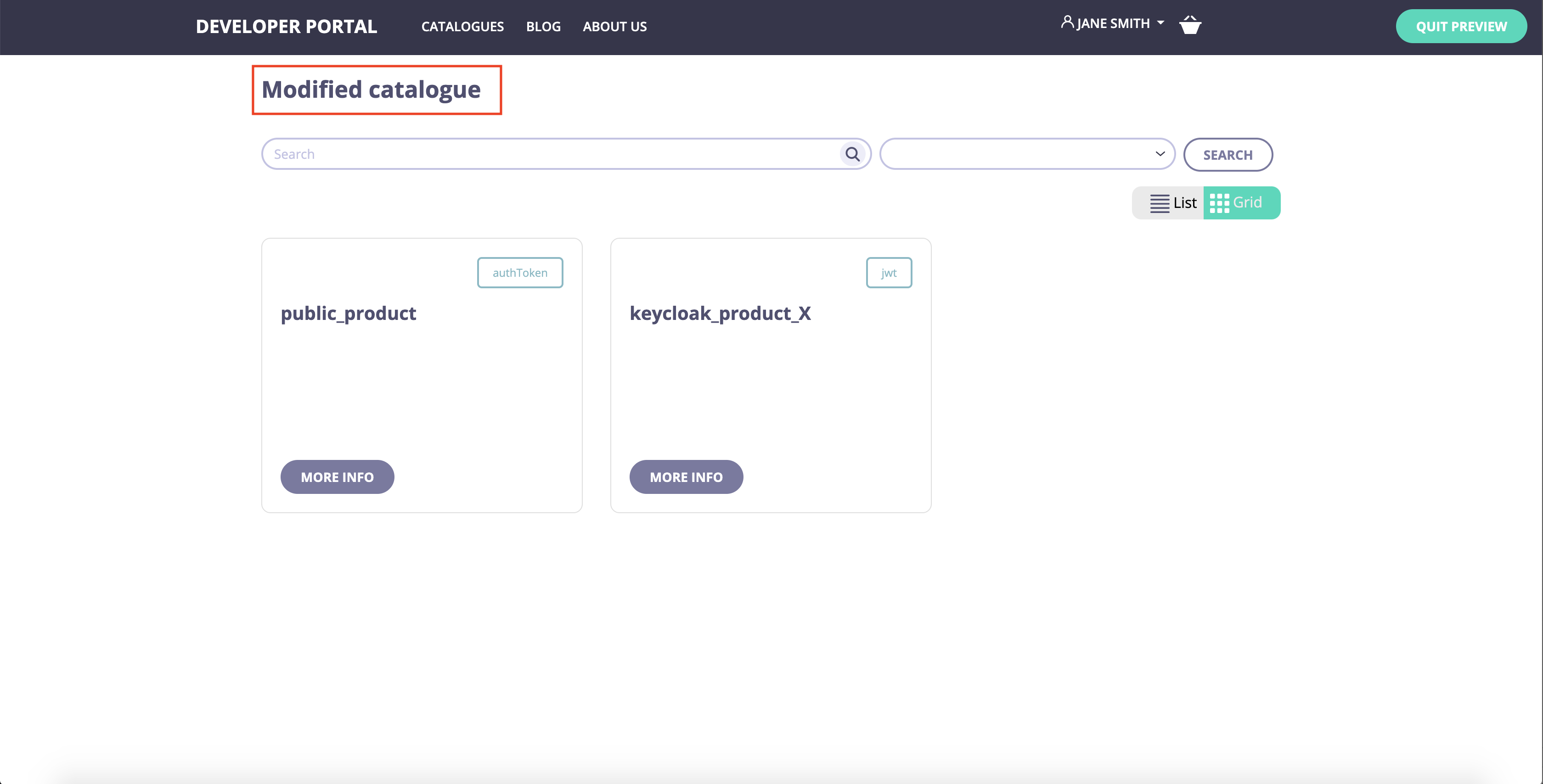
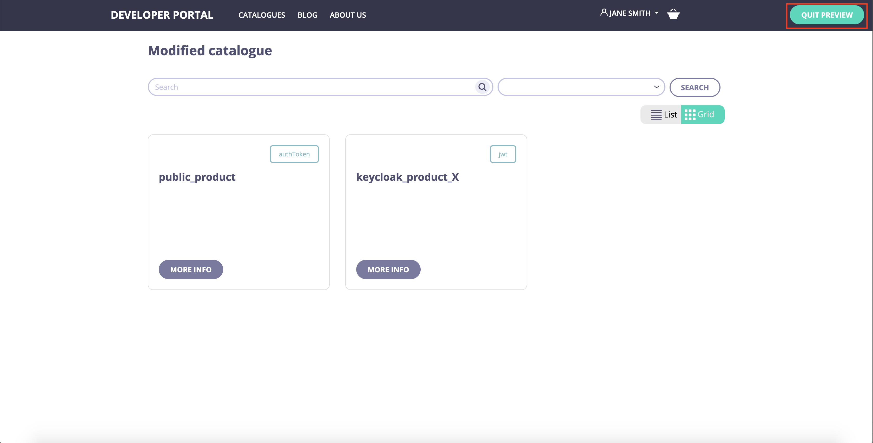
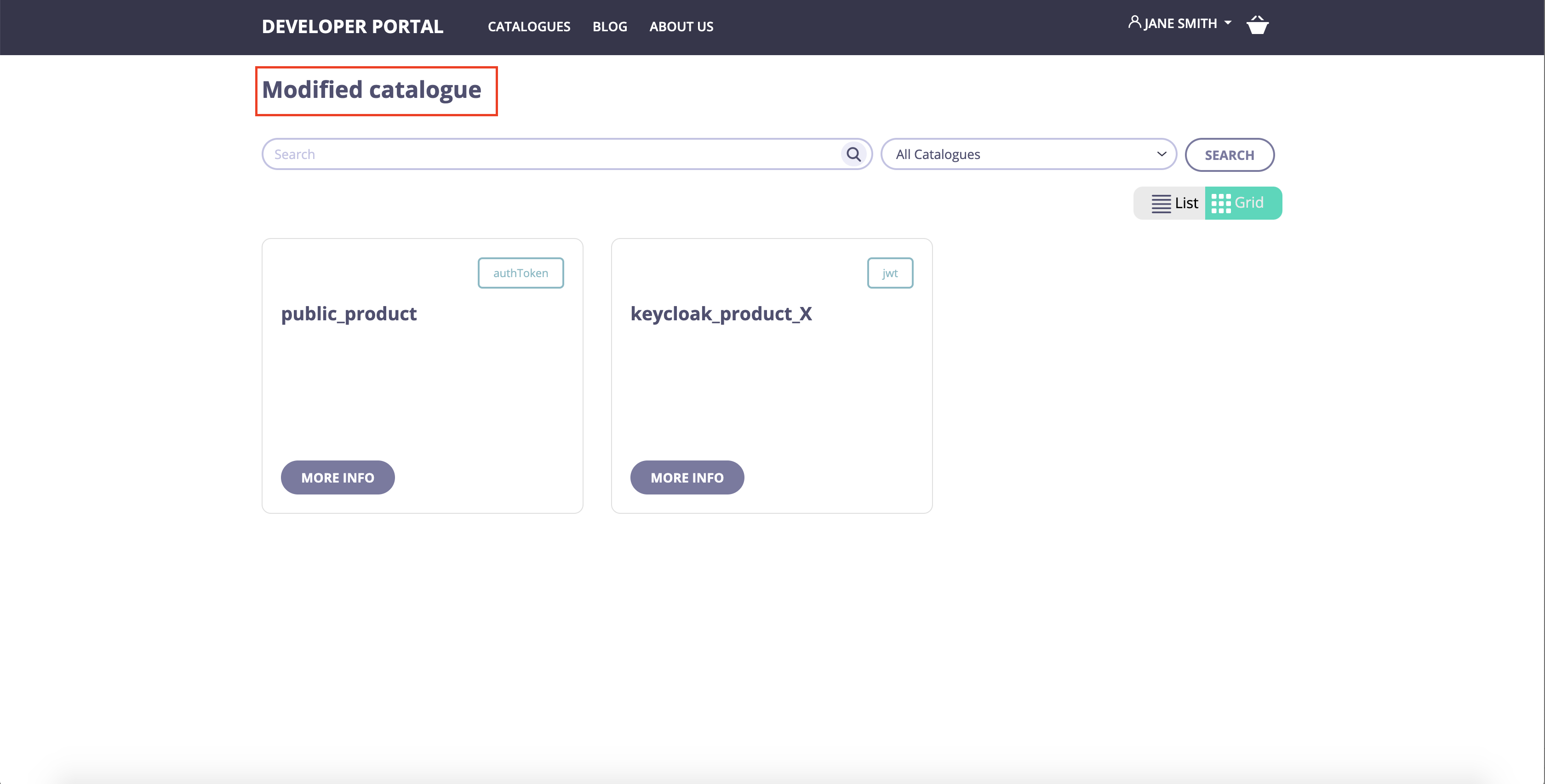
- The previewer will open the selected theme in a new tab. Now you can browse your theme and review the changes. For the demonstration purposes, we’ve modified the API Catalog page so it displays “Modified catalog” instead of “Product Catalogs”.
- Once the review is done, you can quit the preview by clicking on the Quit preview button.
Activate a Theme
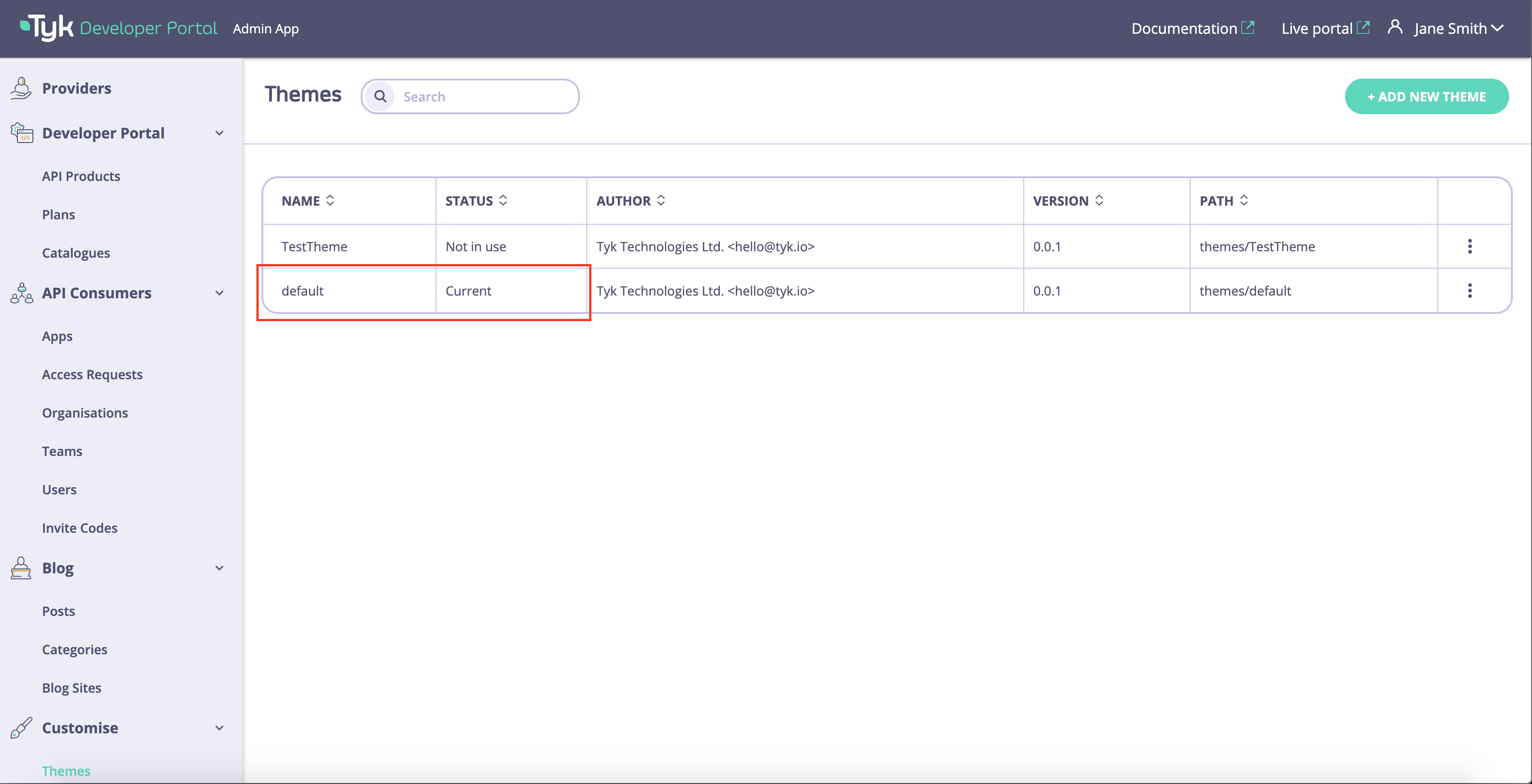
The Tyk Enterprise Developer Portal enables you to have multiple themes at the same time but only one of them is active.- As an admin user, navigate to the Themes menu. The current status of each theme is displayed in the Status column.
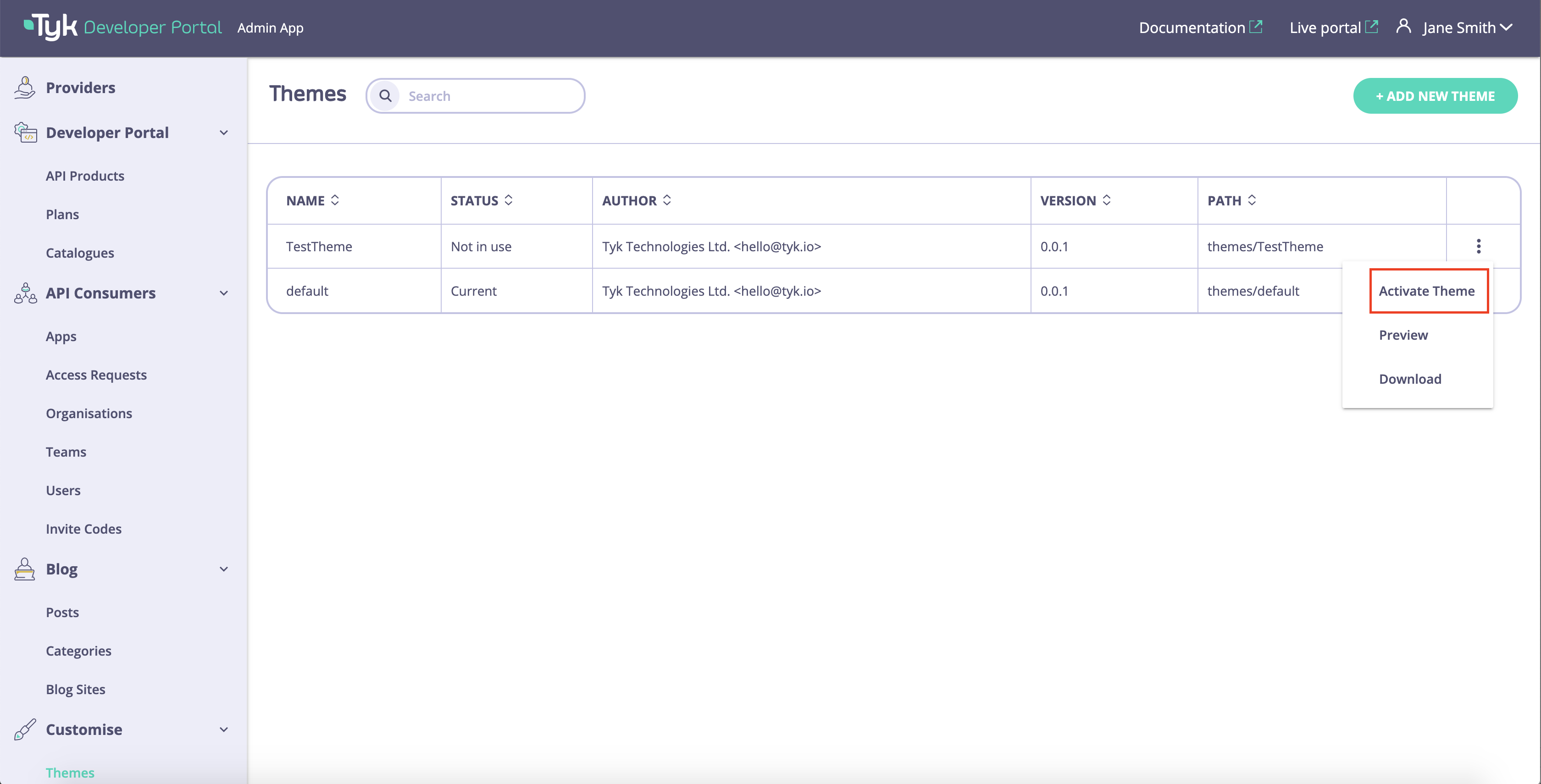
- To activate the new theme, click on the Activate button.
- The selected theme is now active and displayed to all API consumers on the Live portal.
Modify an Existing Theme
The Tyk Enterprise Developer Portal enables modification to any existing theme, except the default one.- To start modification of any existing theme, navigate to the Themes menu and download the theme package.
- Unzip the package, do any required modification and zip it back. You should keep the name of the theme. If you need to change the name of the theme, you will need to create a new theme as described above.
- As an admin user, navigate to the Themes menu and select the modified theme.
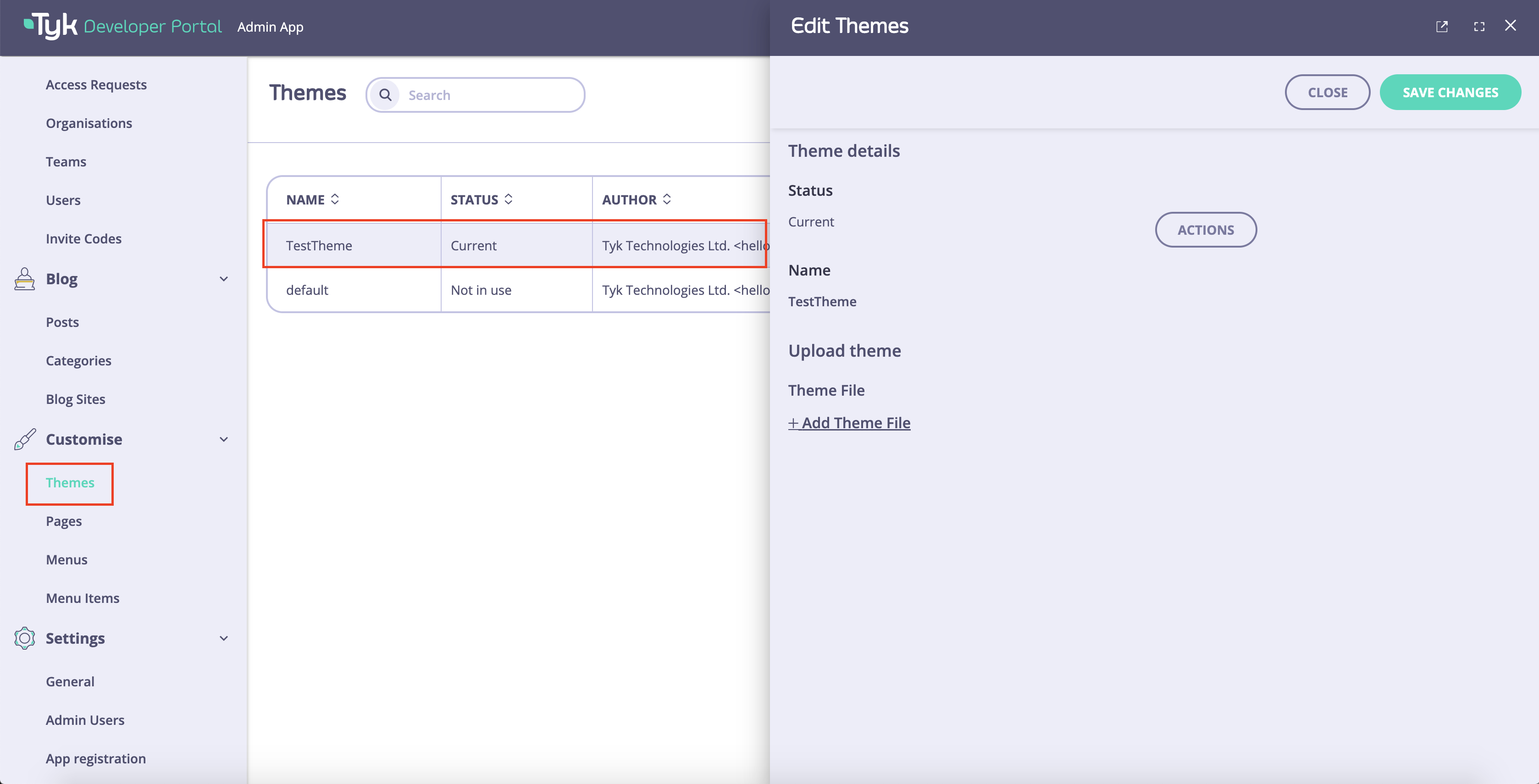
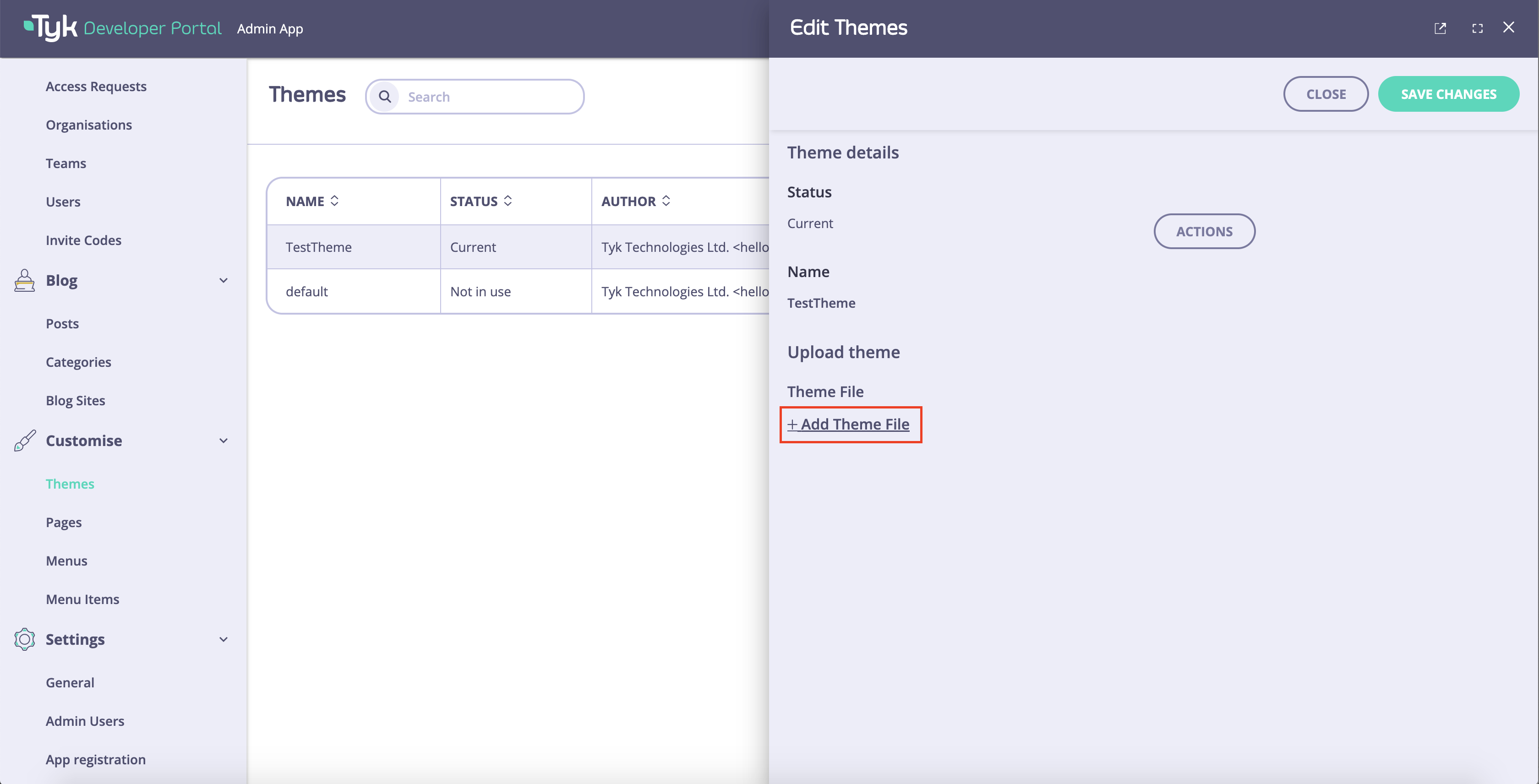
- Click on the Add Theme File button and select the theme archive.
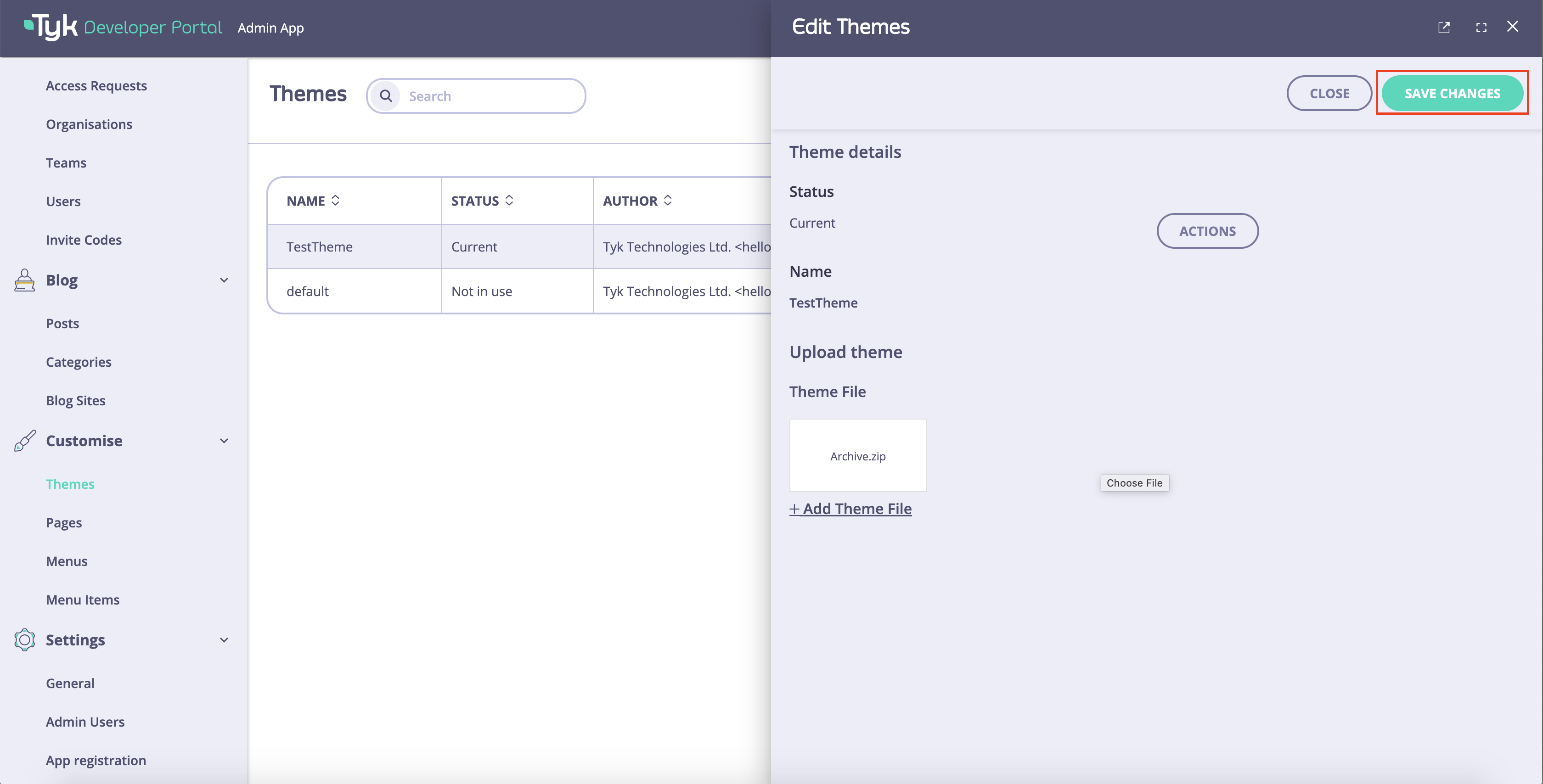
- Click on the Save changes button to save changes to the theme.
- If the theme is the current changes to the Live portal, it will be applied immediately. Otherwise, you can preview and activate the theme as described above.
Upgrading Themes
The Tyk Enterprise Developer Portal does not automatically update the default theme with each new release of the product, because doing so could result in the loss of customizations made by customers. Therefore, customers are required to manually upgrade their themes to access the latest updates and fixes. We recommend using GitFlow for the latest theme updates. Alternatively, you can download the theme package from the Releases section of the portal-default-theme repository. However, we advise against this method, as it requires you to merge your customized theme with the downloaded one, which is much simpler to accomplish via GitFlow. Follow the guide below to obtain the latest version of the portal theme and merge it with your customized version.Merge Latest Changes using Gitflow
The default theme for the Tyk Enterprise Developer Portal is located in the portal-default-theme repository. Themain branch contains code corresponding to the latest stable release. If you wish to check out a specific release (e.g., v1.8.3), you can use tags:
-
Fork the
portal-default-themerepo in github.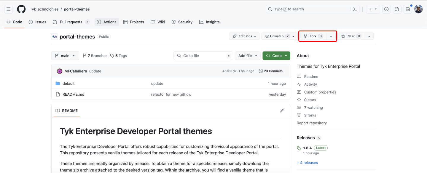
- Clone the forked repository:
- If you have an existing repository, check if you already have the
portal-default-themerepo among your remotes before adding it. Execute the following command to check:
portal-default-theme.
- Add the
portal-default-themeto the remotes by executing the following command:
- Create a new local branch that tracks the remote
mainbranch. That branch will mirror the latest changes from theportal-default-thememain. You will be using it to import the latest changes from theportal-default-themeto your custom theme:
main branch in the portal-default-theme repo, you can just pull the latest updates:
- To start customizing the theme, create a local develop branch from the
portal-default-theme-main:
-
Once the required customizations are completed, commit the changes to the
dev-branch. -
Merge the latest updates from the
portal-default-themeinto thedev-branch. Please remember to always pull the latest changes from theportal-default-theme-mainbranch before merging:
- Checkout to the portal-default-theme-main and fetch the latest changes.
- Checkout the dev-branch and merge the changes from the portal-default-theme-main to retrieve the latest changes from the portal-default-theme repo with the customized theme.
You have successfully updated your custom themeNow you can repeat the above described process when upgrading the portal version to make sure you have incorporated the latest theme changes to your customized theme.
Upload the Theme to the Portal
Once you have merged your local changes with the latest changes from theportal-default-theme repo, you need to create a zip archive with the customized theme and upload it to the portal.
-
Create a zip archive with the customized theme. Make sure you zip the content of the
srcfolder and not the folder itself. To create a zip archive with the customized theme execute the following:- cd to the
srcdirectory to make sure you:
- zip the content of the
srcdirectory:
- cd to the
- Upload the theme package that is created in the previous step to the portal. You can use the portal’s Admin dashboard or the admin API to do it.
- Finally, you need to activate the theme so that it will be applied to the portal.